Data visualization
This guideline offers direction for creating organised layouts and achieving visual clarity that empower users with quick insights, driving informed decisions and streamlined workflows.
#Composition
The data visualization layout is consisting of the following elements:
#Essential elements
- Base layout (New): A concise and informative title and actions that accurately reflects the data's purpose and scope.
- Highlight/Summary : A prominent section that distills the most critical takeaways, KPIs, or actionable alerts. Consider using plain language summaries and visual cues like color or icons to draw attention to key points.
- Data visualization: Select chart types (bar, line, scatter, etc.) based on the nature of the data and the questions users need to answer. Prioritize clarity and ease of interpretation.
- Interactive elements:
#Optional components
- Filters/Controls:Empower users to refine the data view by selecting timeframes, categories, or other relevant dimensions.
- Annotations: Clearly explain the meaning of colors, symbols, and abbreviations used within the visualizations.
- Navigation (For complex data sets): Use tabs, breadcrumbs, or other navigational aids to guide users through multi-layered or interconnected data.
#Layout type
Choose the most suitable layout based on the content, complexity, and user goals: Link to Figma Template component ↗
| When to use | Example |
|---|---|
#Indicator DashboardsIndicator Dashboards offer a quick overview of various data sources, idea for monitoring key metrics and spotting trends rapidly (like DCI Dashboards). When designing them, focus on widgets that clearly present insights, trends, and potential actions concisely, enabling users to understand the core information "at a glance." | 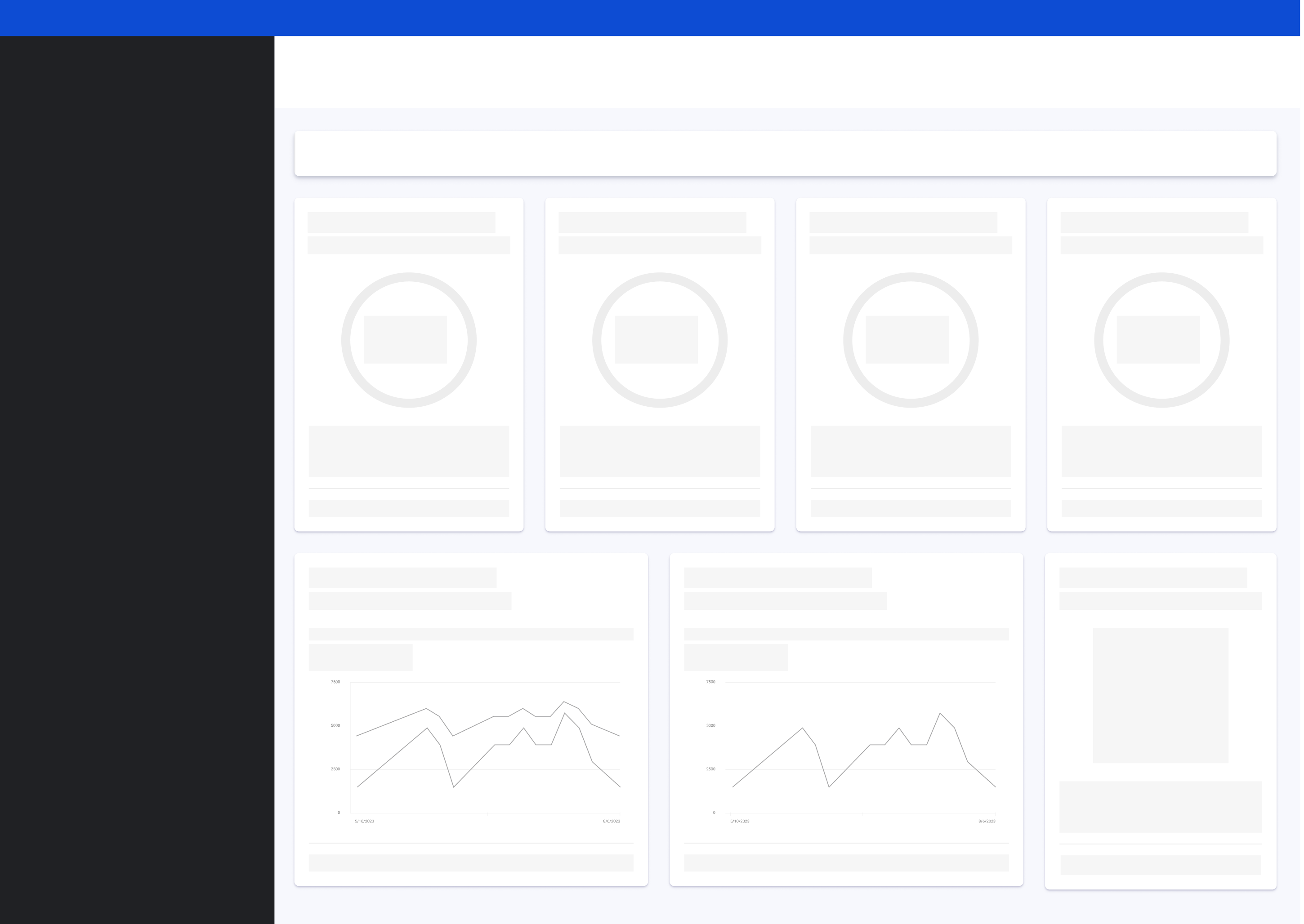 |
#Multi-dimension analyticsMulti-dimension analytics dashboards are for in-depth exploration of a specific topic using various related visuals and comparisons, (e.g., Analytics overview ). Design them to show how data changes over time with charts and to provide detailed data through charts and tables, enabling a deep dive for users. | 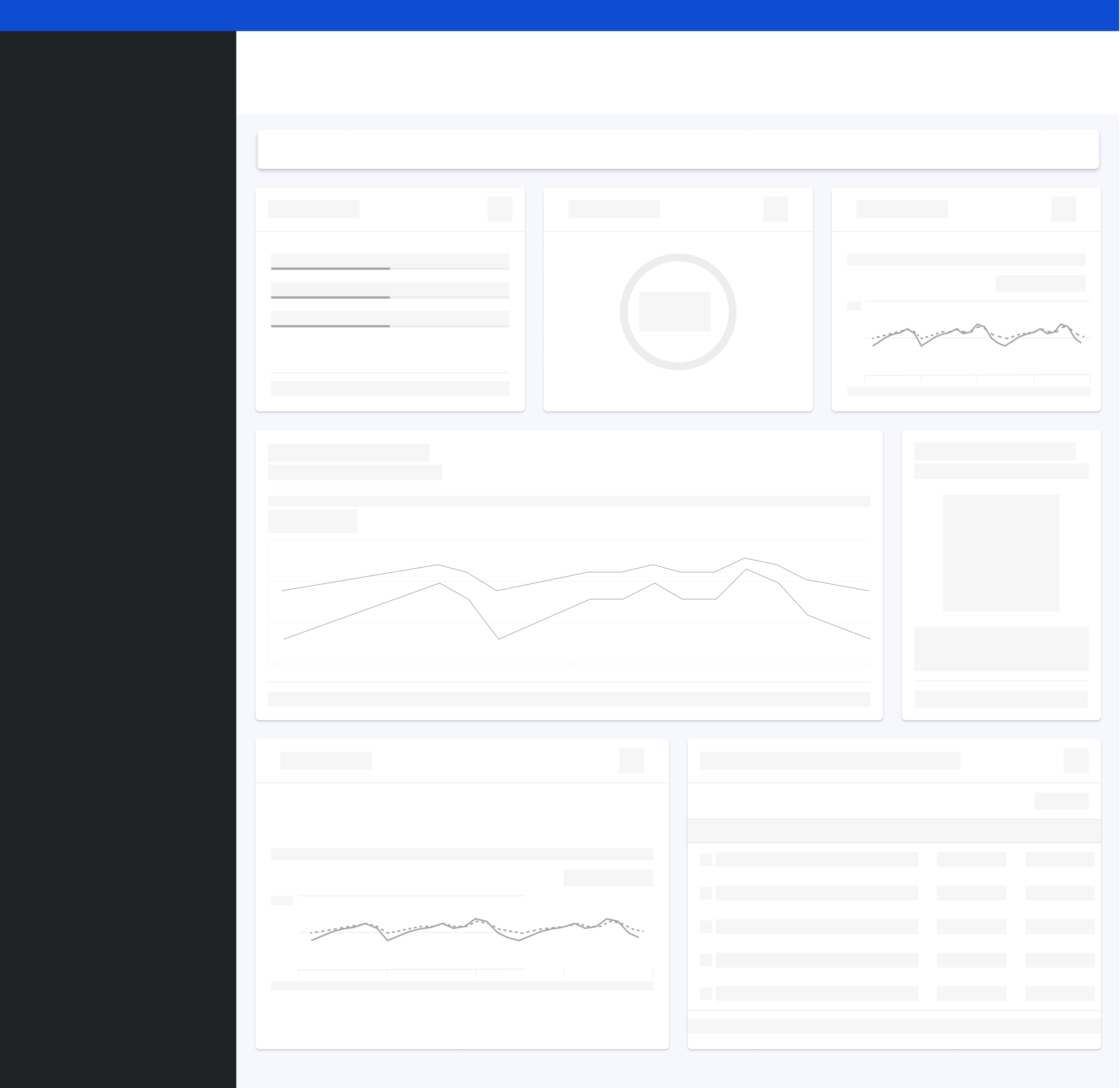 |
#Design suggestions
#Crafting seamless analysis flows with intentional layouts
As designers, our goal is to create intuitive experiences that empower users to understand and act on data. A key part of this is strategically choosing layouts that guide them through their analysis.
Think of it this way: different users have different needs and goals. Decision-makers often require high-level summaries – a bird's-eye view – to inform their strategic thinking. On the other hand, operators need detailed data and the tools to analyze it deeply so they can effectively execute tasks.
By understanding these distinct user roles and their objectives, we can design layout templates that cater specifically to them, ensuring the information presented is always relevant.
The principle of visual hierarchy comes into play when prioritizing key indicators. Our page layouts should naturally draw the user's eye to the most critical data points. This visual prominence helps users quickly grasp what's important and focus their attention effectively.
Ultimately, the sequence of layouts and the way users navigate between them should tell a clear story. We use interactive elements (like links and buttons) and clear navigation patterns to create this narrative flow. This allows users to explore the data in a meaningful way, moving from a general understanding to specific insights and actions. The user interface becomes our storytelling medium, guiding them through the analysis process.
#Imagine this in practice:
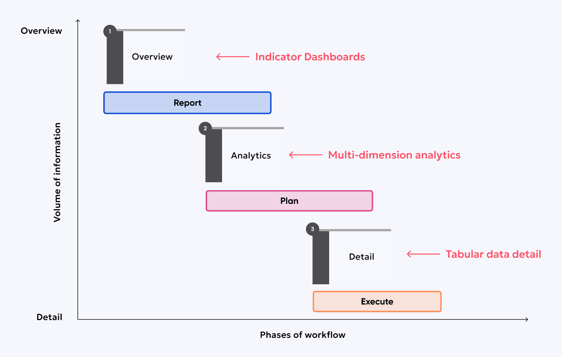
Our platform might start with an Indicator Dashboards Layout, like a DCI dashboard. This is often the entry point, giving our users a broad understanding of the current situation. It's where they typically identify priorities and understand the initial state – what we can call the "Report stage" of their workflow.
From this overview, a user might then click a link within a dashboard widget to navigate to a Module-Level Analytics Layout. Think of pages like an Accessibility Overview or an Analytics Overview. Here, the focus shifts to planning. The user is likely to formulate strategies and determine the specific actions they need to take.
Finally, within a module-level view, they might drill down further to a Detailed Analytics Layout, such as an Accessibility Issue Details page. Here, the user can find in-depth descriptions of specific issues and explore potential solutions. This stage aligns with the "Execution" phase of their workflow.
#Combination of templates
These are the two most common workflows based on user goals.
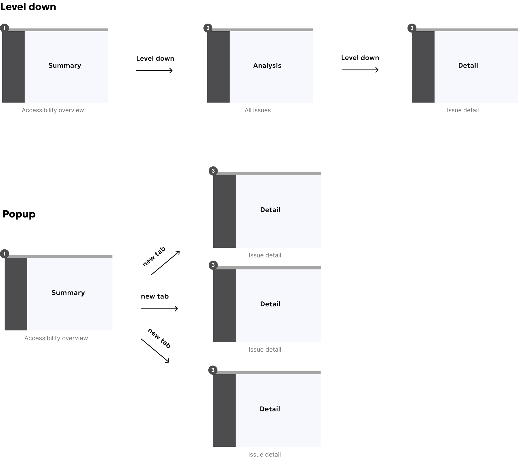
#Level-down approach
From a UX standpoint, the "level-down" approach is about creating a progressive disclosure of information. We're guiding the user from a broad understanding to increasingly granular details. Think of it as an information hierarchy.
The overview layout acts as an entry point, providing a digestible summary and highlighting key areas. This caters to users who want a quick grasp of the situation. The subsequent navigation to module-level and detail layouts supports users who need deeper insights or want to take specific actions. This approach ensures we don't overwhelm users with too much information upfront, allowing them to explore at their own pace.
The consistency in navigation (links, side menu) is crucial for a predictable and user-friendly experience. We need to carefully consider the information architecture to ensure a logical flow and that the navigation pathways are intuitive.
#Popup approach
The "popup approach"—or rather, the "new tab detail view"—offers a way to provide contextual deep dives without significantly disrupting the user's current workflow. Instead of a traditional popup, we're directly opening a new tab that presents a detailed information page, triggered from a summary view. Imagine a dashboard where clicking on a specific widget opens this detailed page in a separate tab, focusing solely on that particular aspect.
This pattern excels for immediate investigation or quick access to granular data without navigating away from the initial overview. It's paramount that these detail pages opened in new tabs are meticulously designed. They must maintain a clear focus, delivering only the most relevant and granular information pertaining to the triggering element.
We need to carefully consider the trigger points for opening these detail tabs. Should it be a direct, clear link on the widget itself? Or perhaps a distinct call-to-action, such as a button labeled "View Detail"? Furthermore, we must define the content strategy for these detail pages, ensuring they offer genuine value and actionable insights.
While opening a new tab minimizes disruption on the original page, over-reliance on this pattern can lead to tab clutter and a fragmented user experience. Therefore, we must be strategic in its application, reserving it for scenarios where a deeper, focused exploration is highly beneficial without losing the overview context.