Detail
This guideline offers direction for creating organized layouts and clear visuals that ensure easy comprehension, focusing on presenting information at the same level of hierarchy.
#Composition
The detail layout is ideal for composing the following elements
#Essential components
- Base layout (Header): Clearly and concisely identifies the page subject, providing immediate context.
- Primary Content Area: :
- Present core information in various formats (text, tables, charts, images).
- Group related information using tabs or accordions to minimize visual clutter.
- Consider using a card layout for complex details to create visual separation.
- Actions/Controls: Place primary actions prominently. For secondary actions, use Action menu or contextual menus to save space (e.g., "Edit," "Share," "Download," "Filter").
#Optional components
- Navigation: Breadcrumbs, secondary navigation, or a "Back" button. Ensure navigation elements don't compete with the main content.
- Related Information: Supplemental data, links to resources, or contextual information. Use Side panel, expandable sections, or a "Related" Tabs to keep this content accessible but not overwhelming.
- Metadata: Information about the data itself (source, last updated, user).
#Layout type
Choose the optimal layout based on content type, complexity, and user goals: Link to Figma Template component ↗
| When to use | Example |
|---|---|
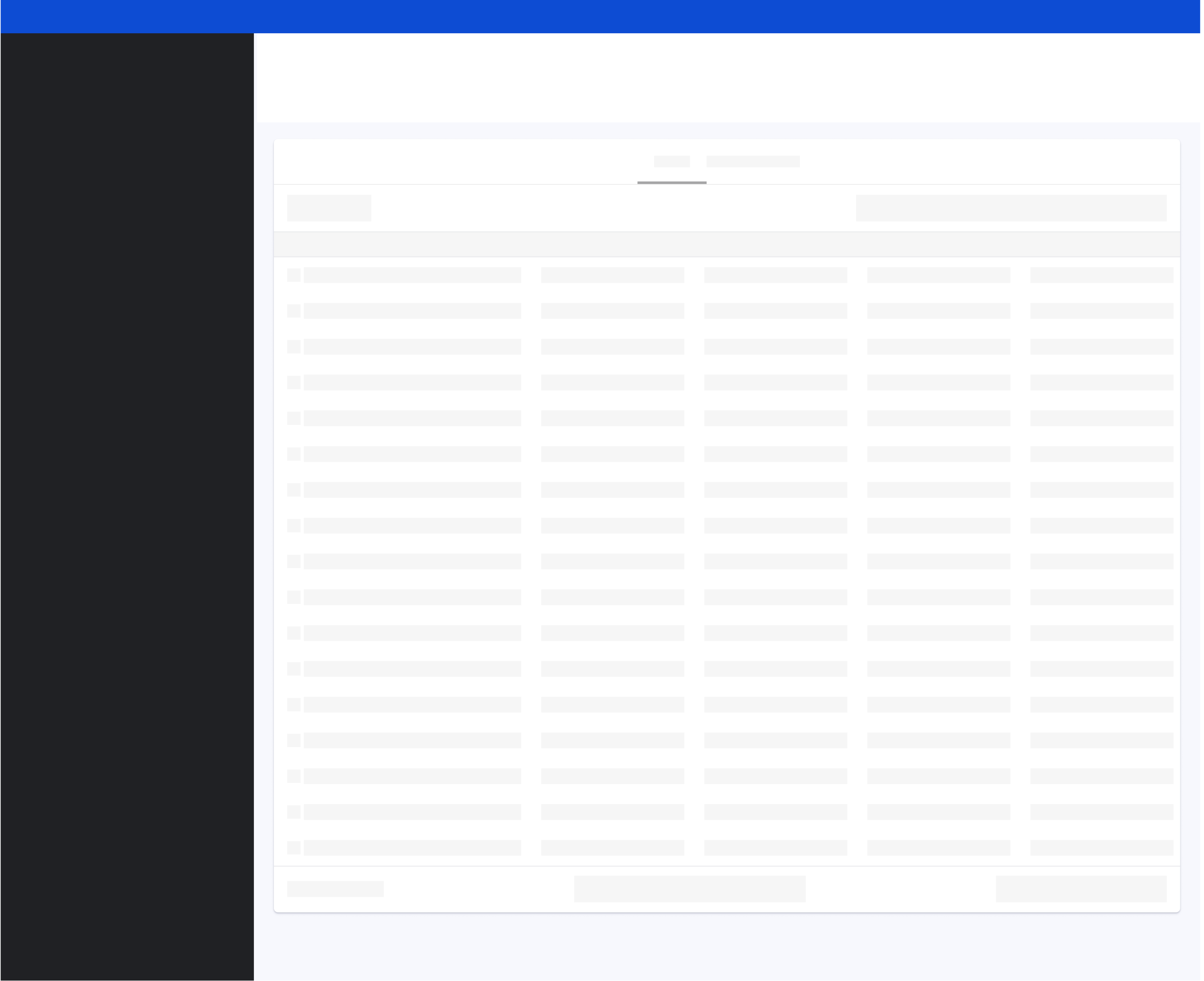
#Tabular data detailUse tabular layouts for structured data with clear relationships between points. This is ideal for data like Accessibility Issues. Design considerations include
|  |
#Summary detailThe summary detail layout is ideal for effectively summarizing key metrics, progress indicators, and textual details for one specific item. When designing these layouts:
This is effective for data like (e.g. Accessibility Issue descriptions or Analytics most popular pages ). | 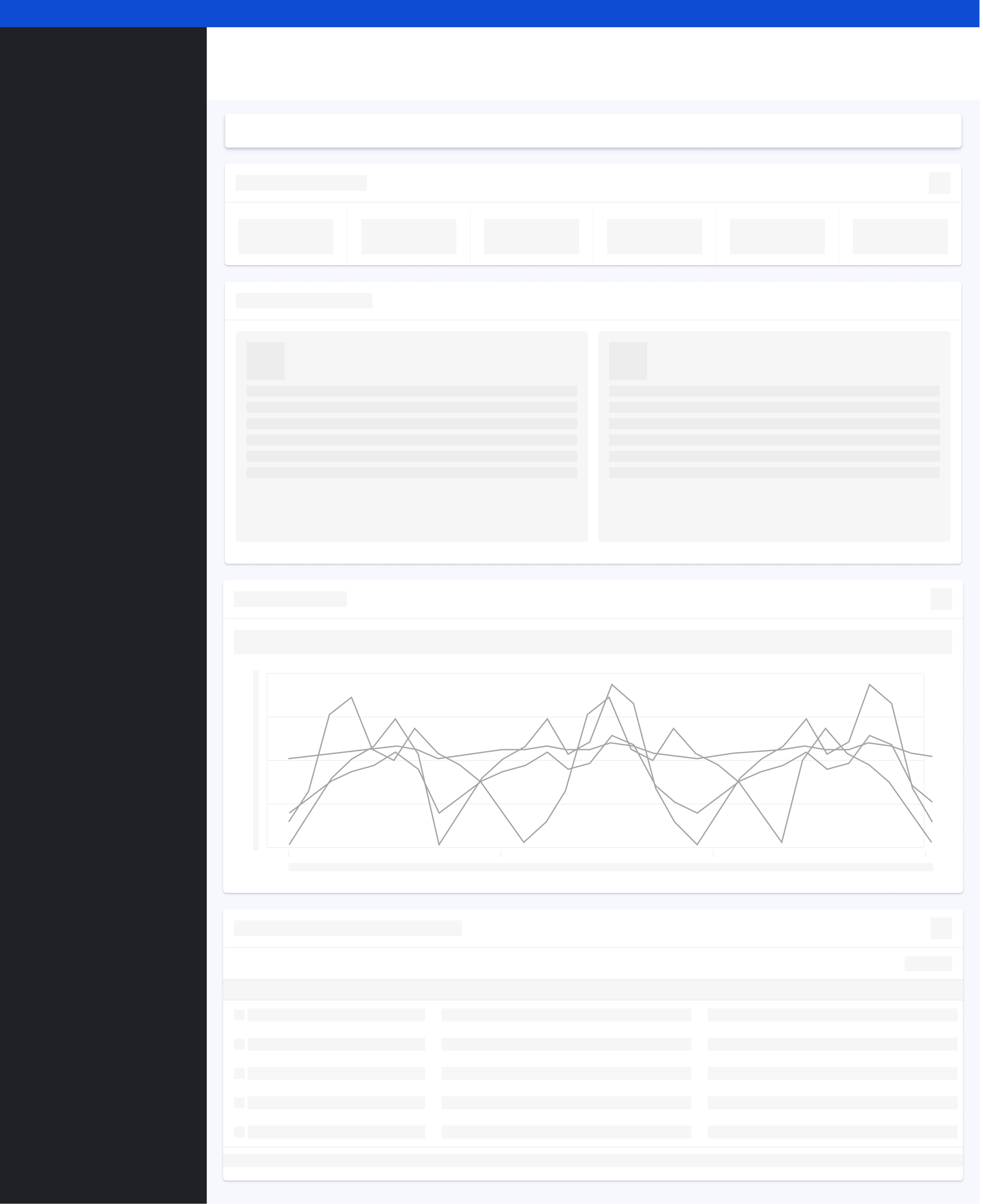 |
#Complex detailThe complex detail layout is ideal for scenarios requiring detailed exploration through combined visualizations, filtering, and text. (e.g., Ads campaign details). When designing these layouts:
Ensure you provide clear filtering controls to manipulate the data, select suitable chart types for the information being presented, and offer explanations for any complex visualizations to aid user understanding. | 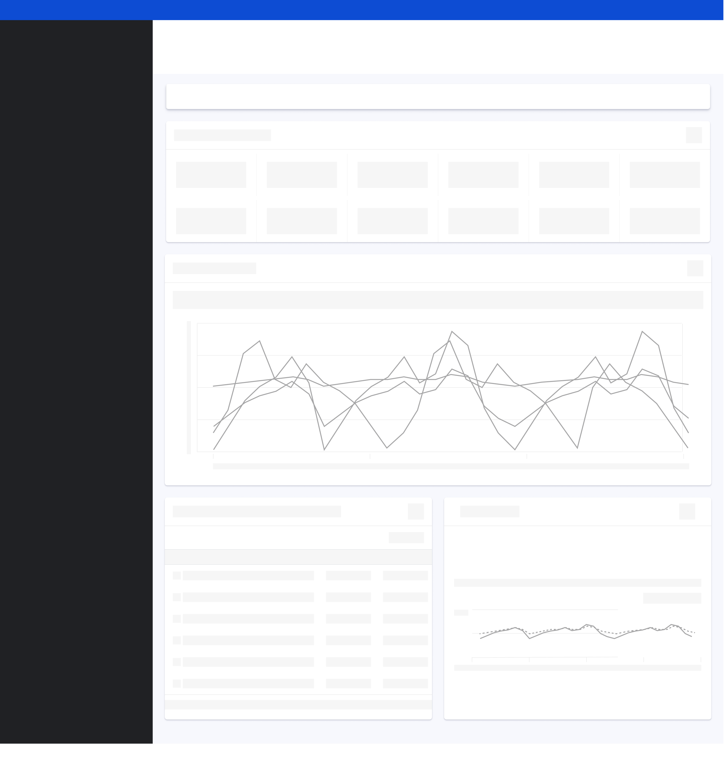 |