Color
Color isn't just about aesthetics. It's a powerful tool we use to guide you effortlessly through our products, strengthen our brand identity, and highlight the information that matters most.
#Overview
#Color has purpose
At Siteimprove, color does more than just look good. It's a strategic tool used to:
- Guide users: Color clarifies interactions and helps users navigate effortlessly.
- Reinforce our brand: Our color choices create a consistent, recognizable Siteimprove experience.
- Direct attention: Color highlights the most critical information for quick comprehension.
Use color to communicate meaning clearly. For example, color can signify success, potential issues, or key actions.
Use color purely as decoration. It should always serve a functional purpose.
#Colour has impact
Color should be used thoughtfully to maximize its effect. Consider the following:
- Highlight what matters: Vivid color draws the user's eye to the most critical elements and actions.
- Establish a clear hierarchy: Use a range of shades within color families to guide users through complex information.
Reserve bold colors for essential actions or urgent messages.
Overuse color. A focused approach ensures that the most important elements truly stand out.
#Colour is accessible
Our color choices always prioritize accessibility, ensuring everyone can easily understand and use our products. Our palettes offer sufficient contrast to:
- Aid in readability: Text must be easily legible against any background color.
- Clarify interactions: Buttons, links, and other interactive elements should stand out clearly.
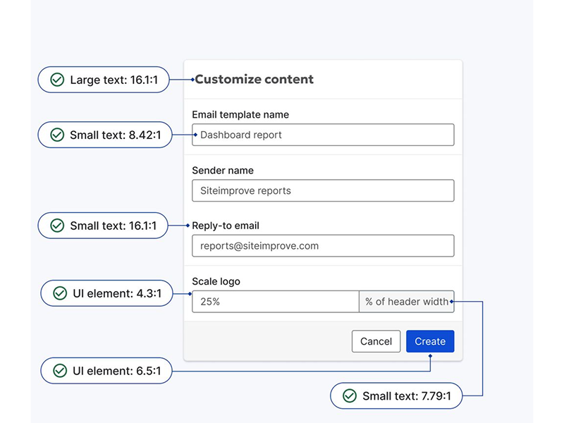
Refer to our Accessibility Checklist for specific color contrast guidelines, ensuring your designs meet WCAG standards.
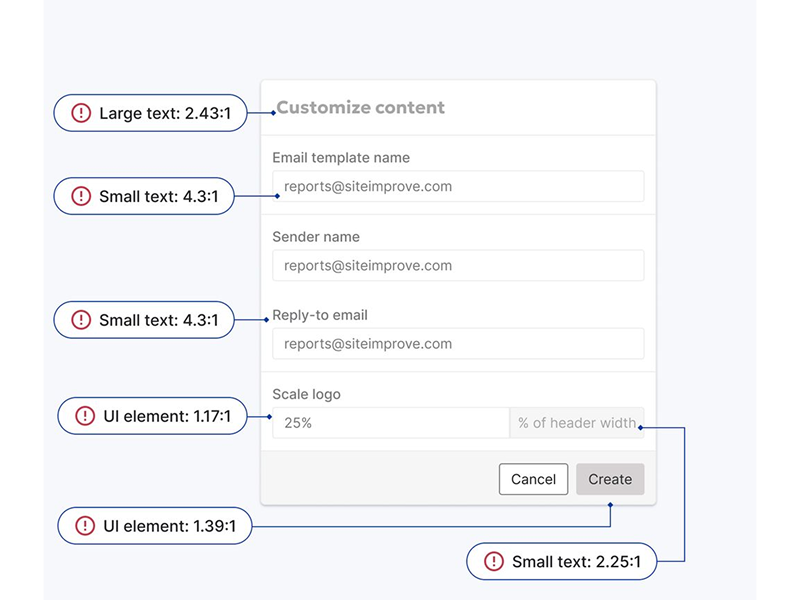
Sacrifice clarity for aesthetics. Accessibility is paramount.
#Core Product Colors
To ensure brand consistency across all Siteimprove products, prioritize these core colors. While Fancy's design system offers a broader palette, these core product colors should be your default choice for building interfaces.
#Content
These define the core colors used for text, icons, and other UI elements, ensuring readability and visual hierarchy.
| Swatch | Role | Hex | Usage examples |
|---|---|---|---|
Content Primary |
| Used for the most important textual content. | |
Content Secondary |
| Used for less prominent text, such as labels or support text. | |
Content Tertiary |
| Used for the least emphasized text, such as hint text. | |
Content Link |
| Used to highlight links and interactive elements. |
#Interactive
These colors guide user interactions by providing visual feedback on hover, active, focus, and disabled states for interactive elements like buttons and links.
#Primary
| Swatch | State | Usage examples |
|---|---|---|
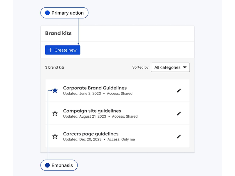
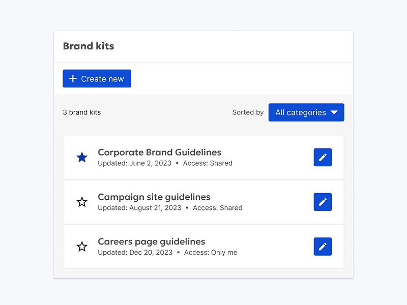
Normal | Used for the most prominent actions (primary buttons, links). | |
Hover | Color when hovering over an element (like a button). | |
Active | Color when clicking or pressing an element. | |
Focus | Color of a chosen element. | |
Disabled | Color of an unavailable element (like a button you can't click). |
#Secondary
| Swatch | State | Usage examples |
|---|---|---|
Normal | Used for secondary actions (secondary buttons, starred list items). | |
Hover | Color when hovering over an element (like a button). | |
Active | Color when clicking or pressing an element. | |
Focus | Color of a chosen element. | |
Disabled | Color of an unavailable element (like a button you can't click). |
#Default
| Swatch | State | Usage examples |
|---|---|---|
Normal | Subtle interactive elements (input fields, default button borders). | |
Hover | Color when hovering over an element (like a button). | |
Active | Color when clicking or pressing an element. | |
Focus | Color of a chosen element. | |
Disabled | Color of an unavailable element (like a button you can't click). |
#Destructive
| Swatch | State | Usage examples |
|---|---|---|
Normal | Destructive actions (delete, permanent changes). | |
Hover | Color when hovering over an element (like a button). | |
Active | Color when clicking or pressing an element. | |
Focus | Color of a chosen element. | |
Disabled | Color of an unavailable element (like a button you can't click). |
#Background
These create the foundation of the visual interface, defining the colors for main content areas, cards, and other UI elements, contributing to a clean and organized look.
| Swatch | Role | Hex | Usage examples |
|---|---|---|---|
Background Main |
| The default background color for most screens. | |
Background Primary |
| Used for elevated surfaces, creating visual separation from the main background (cards, tables, lists). | |
Background Secondary |
| Used to delineate sections within a page or container without using hard borders (action bars, footers). | |
Background Overlay |
| Applied as a semi-transparent overlay on top of other content when using modals, dialogs or sidebars. |
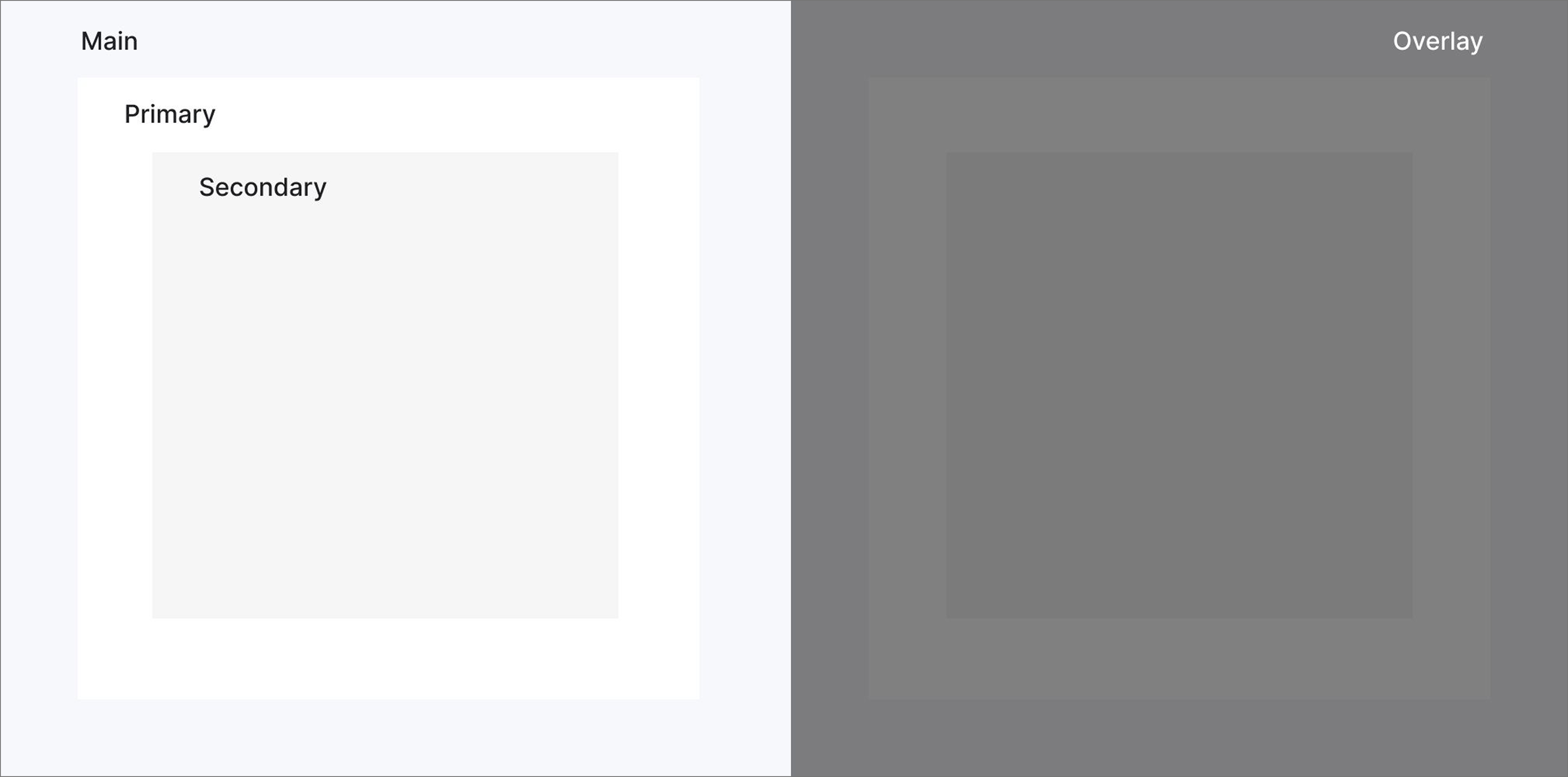
#Layering backgrounds
To create visual depth and hierarchy, layer background colors in the following order (from bottom to top):
- Background Main: The foundation of your UI. Use it for the overall background of most screens.
- Background Primary: Apply to elements that need to stand out from the main background, such as cards, tables, and lists. This creates visual hierarchy and draws attention to these elements.
- Background Secondary: Use to subtly separate sections within a page, like footers or headers, or to delineate content areas.
- Background Overlay: A semi-transparent overlay for modals and dialogs to focus user attention by dimming the background.
#Sentiment
These colors convey emotions and highlight the importance of information, helping users quickly understand the context and nature of messages or system states.
| Swatch | Role | Hex | Usage examples |
|---|---|---|---|
Positive |
| Signals positive outcomes, completed tasks, and successful interactions. | |
Warning |
| Draws attention to potential issues, errors, or actions requiring caution. | |
Negative |
| Reserved for critical errors, high-risk actions, or states that require immediate attention. | |
Neutral |
| Used for important transactional information that doesn't require user action. | |
Subtle |
| The default choice for most text and basic UI elements. |
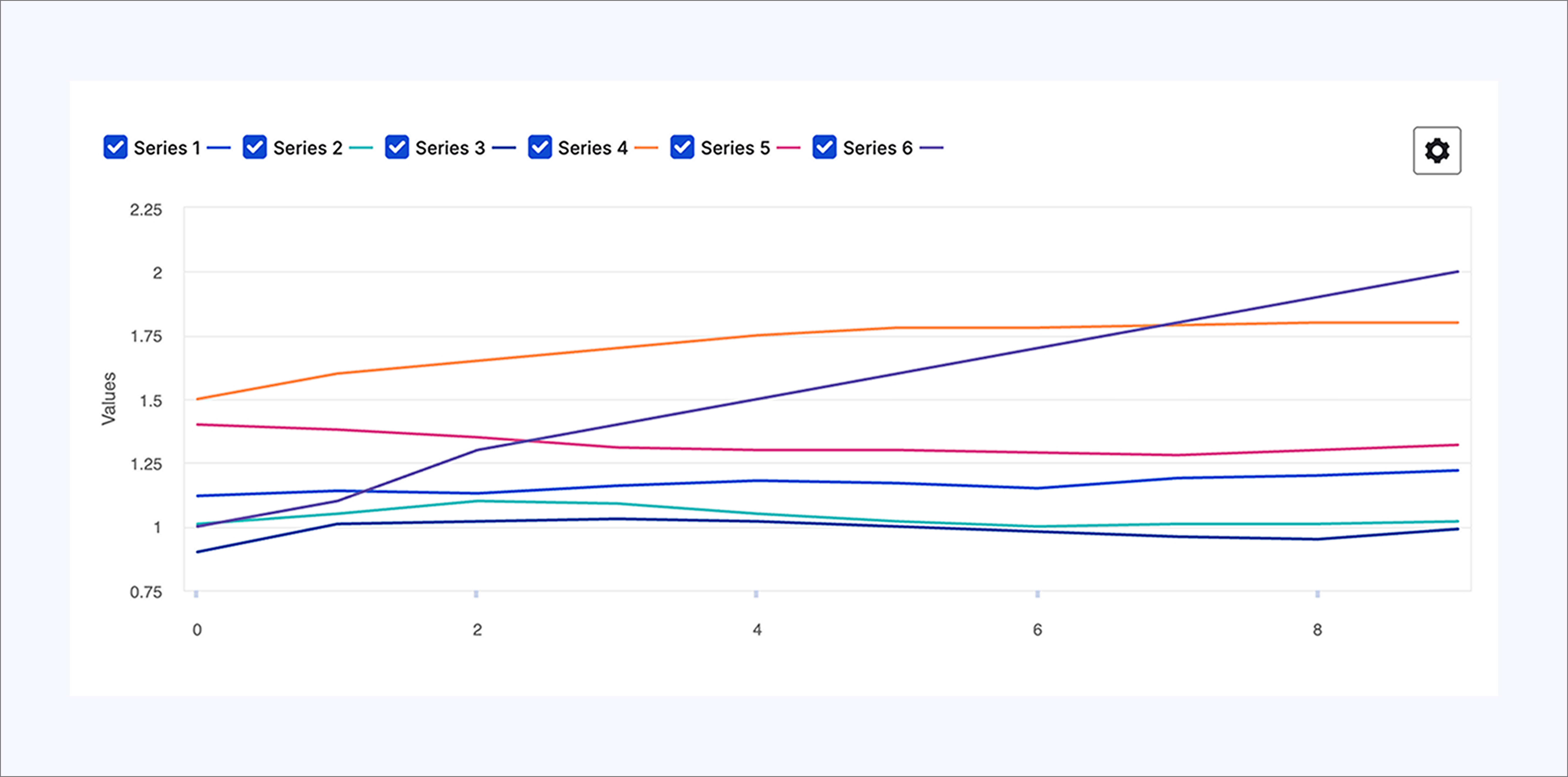
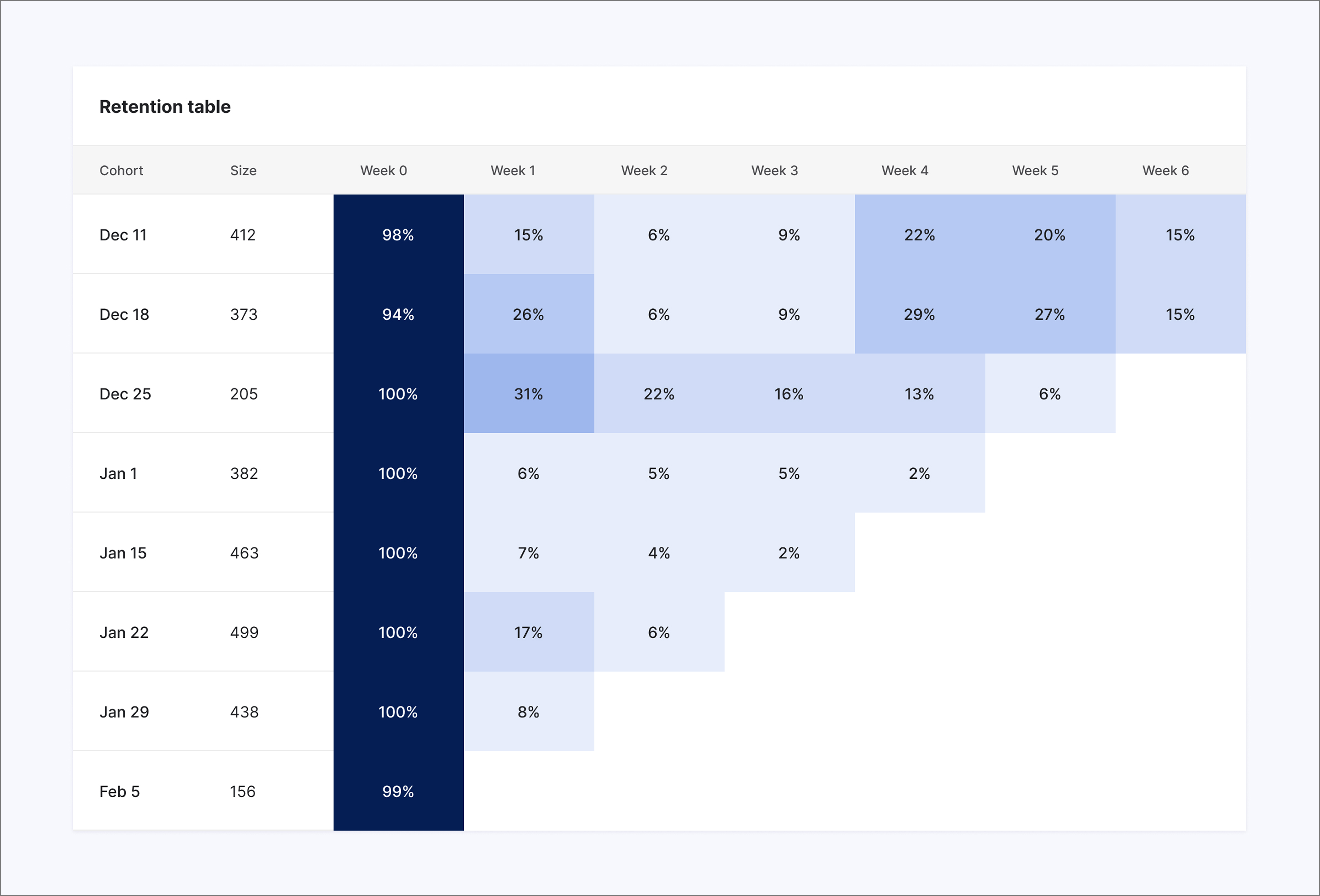
#Data Visualization
Data visualizations make complex information beautifully clear. They transform numbers into charts, graphs, maps, and more, revealing patterns and insights. Color is a crucial tool in effective data visualisation.
#Categorical
This palette provides distinct colors for visualising categorical data where no inherent order or relationship exists between the categories. To ensure optimal contrast, apply the colors in the sequence shown below.
| Swatch | Role | Hex |
|---|---|---|
Chart 1 |
| |
Chart 2 |
| |
Chart 3 |
| |
Chart 4 |
| |
Chart 5 |
| |
Chart 6 |
| |
Chart 7 |
| |
Chart 8 |
|
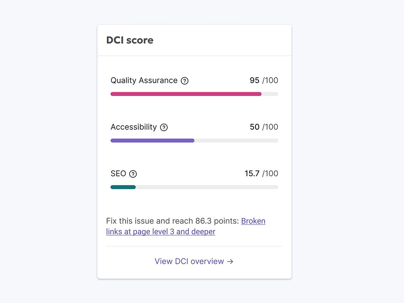
#Sequential
Use cool palettes for charts and data visualization where darker colors represent larger values. For progress indicators, use scale palette instead of warm palettes for better clarity and accessibility.
| Swatch | Role | Hex |
|---|---|---|
Sequential 1 |
| |
Sequential 2 |
| |
Sequential 3 |
| |
Sequential 4 |
| |
Sequential 5 |
| |
Sequential 6 |
| |
Sequential 7 |
| |
Sequential 8 |
| |
Sequential 9 |
| |
Sequential 10 |
|
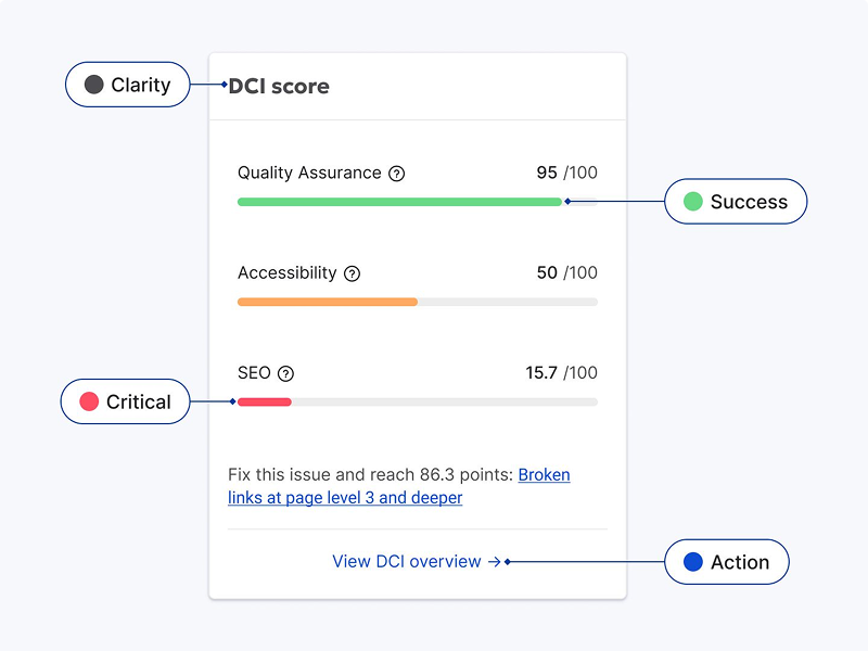
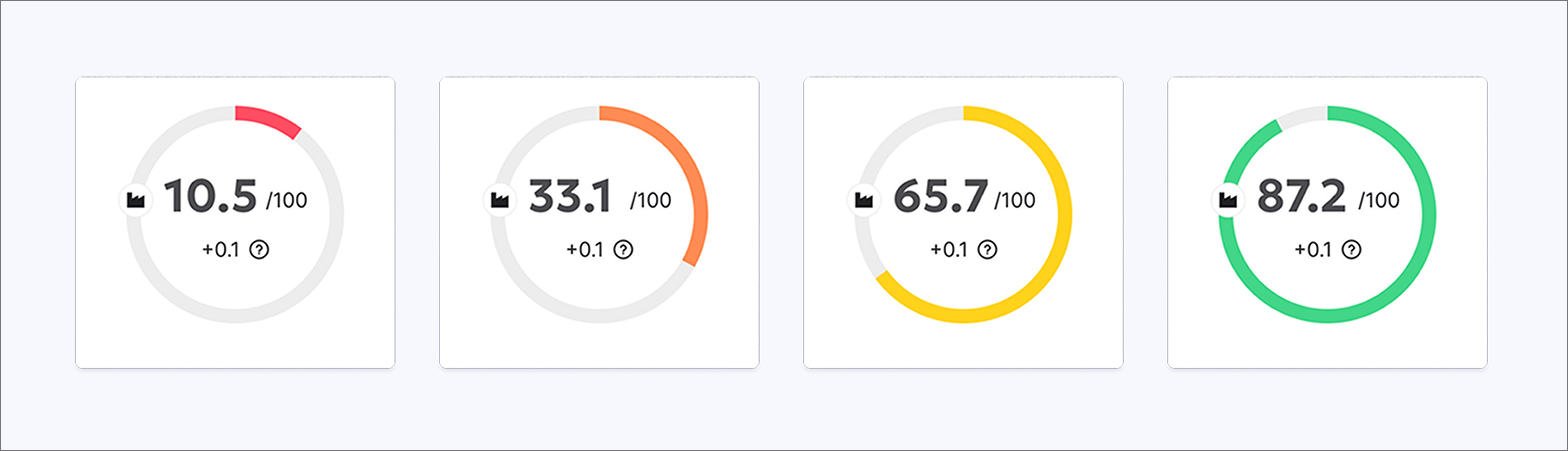
#Scale palette
Our color scale makes progress tangible. The color transition motivates users, shifting towards green as they approach a goal's completion. The cool scale is used more selectively. It's best suited for illustrating sequential information, such as steps in a workflow, or for visualizing data points that don't inherently represent progress towards a defined outcome.
| Swatch | Role | Hex |
|---|---|---|
Scale 1 |
| |
Scale 2 |
| |
Scale 3 |
| |
Scale 4 |
|
#Color Tokens
For most Siteimprove product experiences, colors are applied using design tokens. This means rather than choosing a certain shade or value, you’ll choose a design token to apply colors.