Choosing chart types
This guideline offers direction for choosing charts that effectively transform raw data into meaningful insights, enabling users to identify trends, spot anomalies, and compare metrics.
#Purpose
- Identifying trends: how metrics change over time.
- Identifying anomalies: deviations from expected patterns.
- Comparison: Similarities and differences between metrics.
#Chart type
According to Nielsen Norman Group , researchers have found that bar charts, line charts, and scatter plots are easiest to understand. Other chart types require users to visually assess angle, area, or volume to understand the data. Choose the most suitable chart based on the content, complexity, and user goals.
| Chart | Example |
|---|---|
#Bar chart (Column chart)Versatile for comparisons and distributions, especially when categories are clearly defined. | 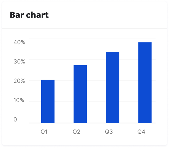 |
#Paired bar chartIdeal for directly comparing two related data sets (e.g., before and after). Example: Analytics > Behavior > Funnels > Funnel analysis (Comparison tab) | 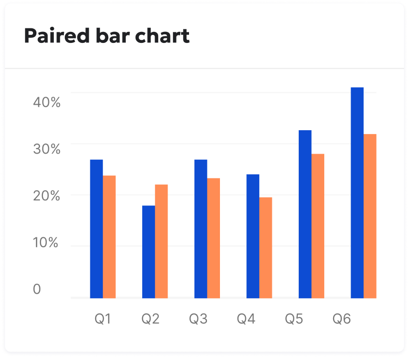 |
#Horizontal bar chartPreferable when category labels are lengthy. | 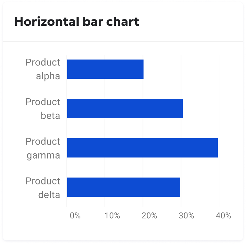 |
#Line chartBest for illustrating trends and changes over continuous time periods. Example: DCI > My sites | 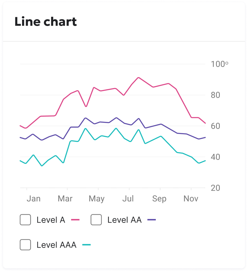 |
#Bubble chartReveal correlations and patterns between two to four numeric variables. Example: SEO > Keyword monitoring > Search engine visibility | 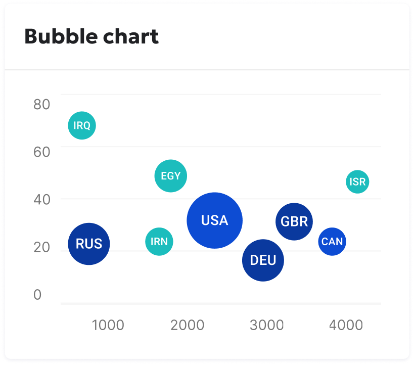 |
#Pie chartEffectively communicate proportions or percentages of a whole. Example: Analytics > Visitor > Countries | 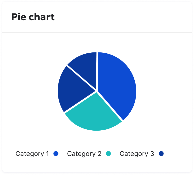 |
#Matrix / HeatmapUseful for large, complex datasets where patterns and relationships need to be visually highlighted. | 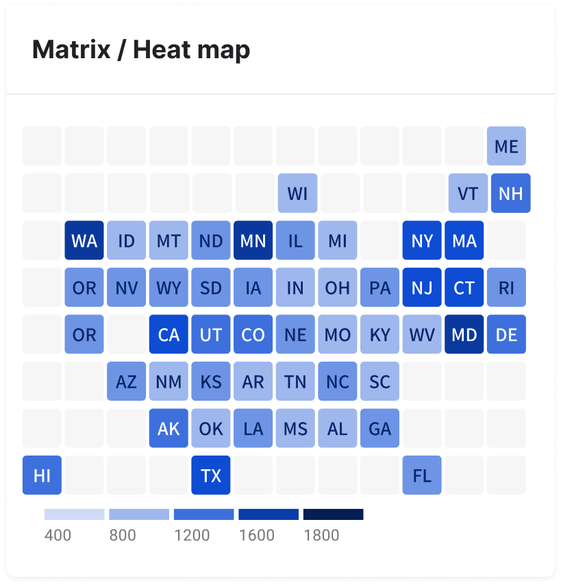 |
#Flat gaugePerfect for displaying progress towards targets or goals. It's useful where space may be limited. | 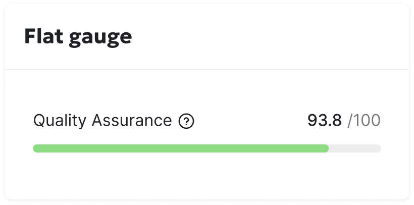 |
#Polar gauge (DCI score gauge)Perfect for displaying progress towards targets or goals., with the circle representing 100% of the goal. Example: DCI dashboard | 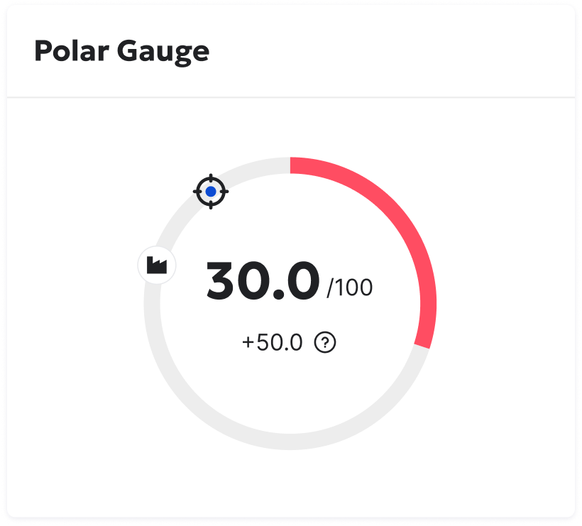 |
 | |
#MapEssential for showcasing data tied to specific locations. Examples: Analytics > Visitor > Countries | 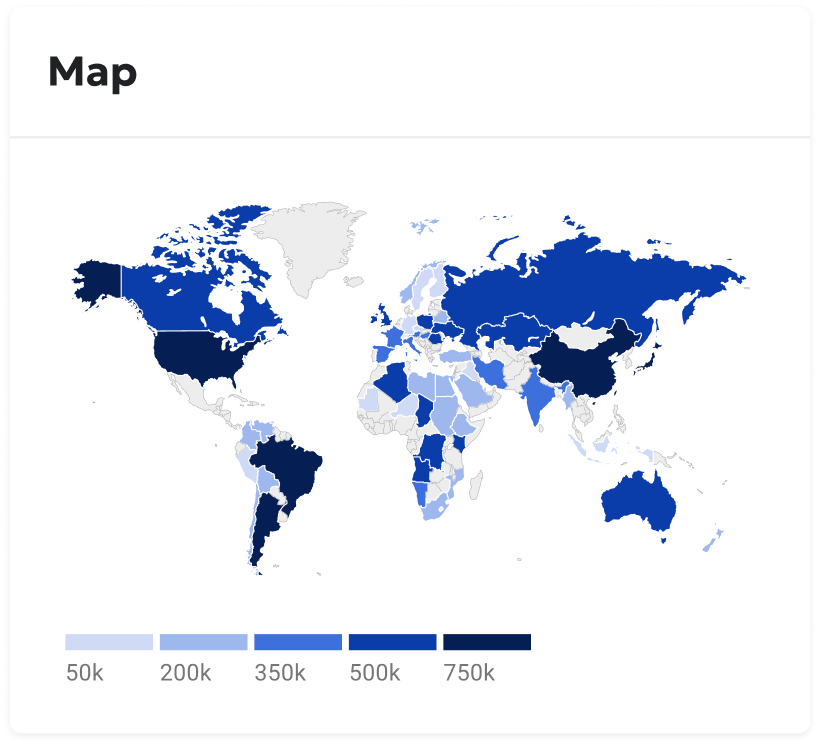 |
#Bubble map variationAdds another dimension to maps by showing the magnitude of values at different locations. Examples: Performance > Performance overview > Page overview > Page performance | 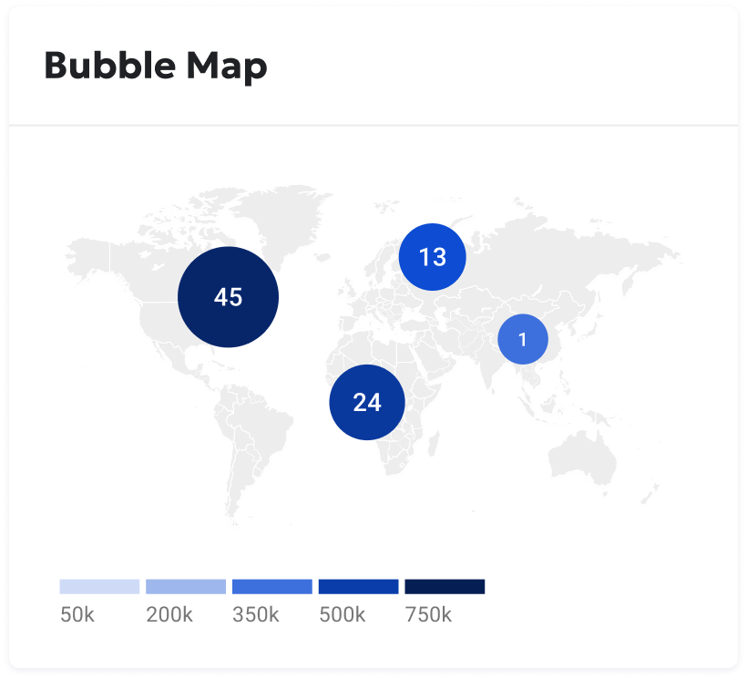 |
#Chart tooltip
| Description | Example |
|---|---|
A chart tooltip is a message that appears when you hover your cursor over a chart element like a data point, icon, or truncated text. Tooltips provide more detailed information or context for that specific element. Visually links each item in the tooltip list to its corresponding element on the chart using a colored line segment or icon. This makes it easy to connect the tooltip information back to the chart. Example: DCI > Site progress | 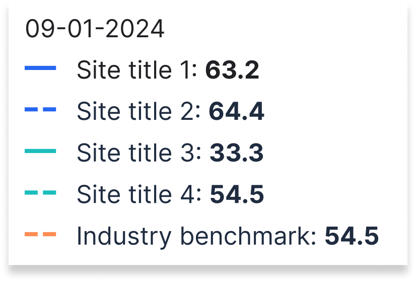 |
#Guidelines
#Do
#Don't
#Accessibility
Explore detailed guidelines for this component: Accessibility Specifications