Grid
Use our grid system to create consistent, responsive layouts across Siteimprove products.
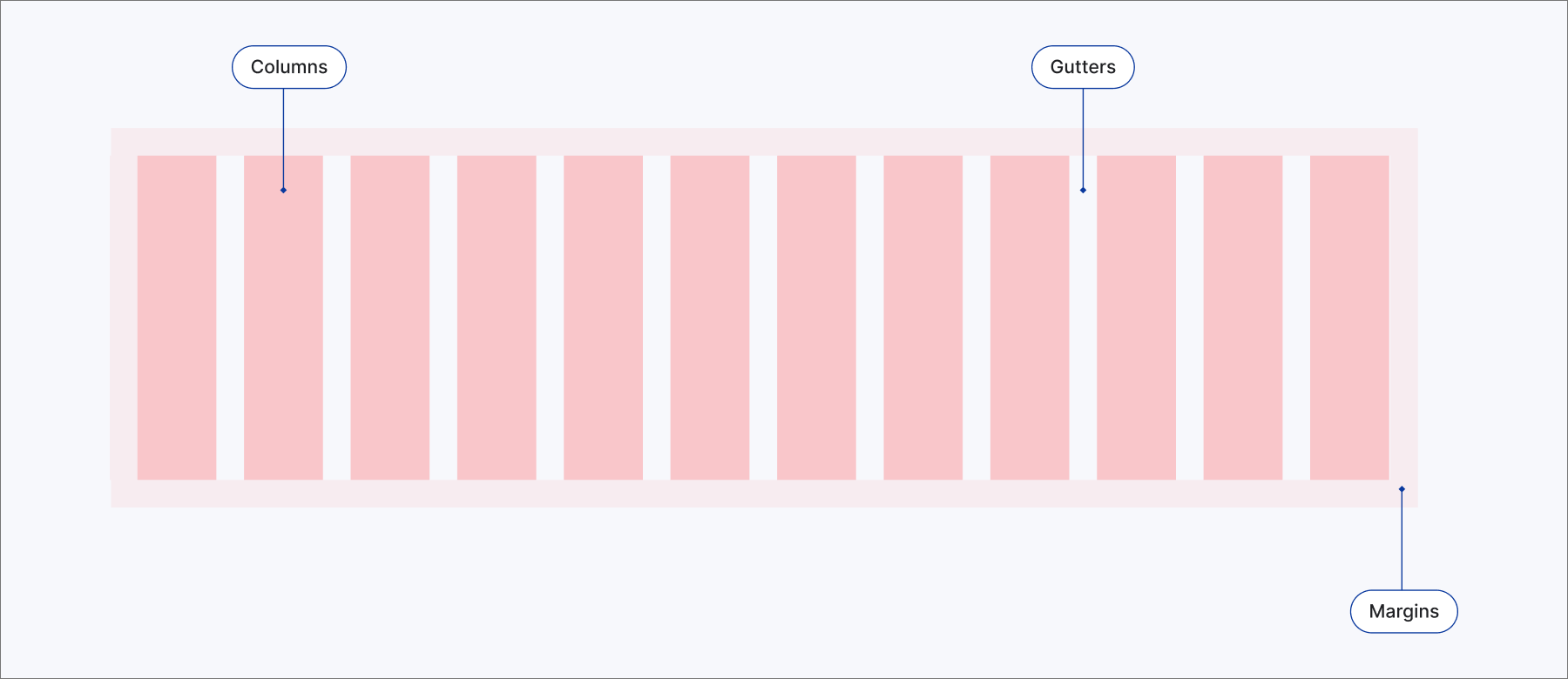
#Grid anatomy
Our grid system is the invisible backbone of our designs, ensuring visual harmony, clear hierarchy, and seamless responsiveness across all Siteimprove products. This consistency is key to building user trust and reducing cognitive load.
#Grid elements
The grid system is composed of three primary elements that establish structure and visual hierarchy:
- Columns:We use a 12-column grid for maximum flexibility in vertical content division.
- Gutters: These provide visual breathing room and separate content blocks.
- Margins: This empty space around the content area separates content from screen edges.
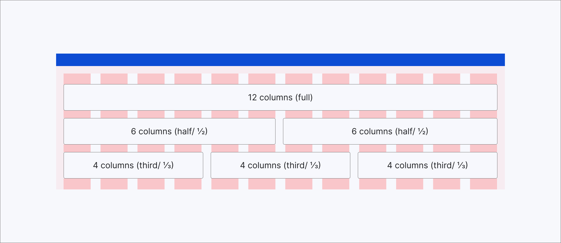
#Building layouts with Grid.Section
The Grid.Section component is your primary tool for defining content widths within our grid. It uses intuitive, semantic terms that abstract away complex calculations, allowing you to focus on content proportion and visual flow.
full(12 columns or 100%) : Occupies a whole row. Use for primary content areas, single dashboards, or simple forms that need full focus.half/½(6 columns or 50%): Occupies half of the row's width. Use for side-by-side comparisons, paired content blocks, or grouping related form fields.third/⅓(4 columns or approximately 33.33%): Occupies a third of the row's width. Use for three-column layouts, detailed dashboards, or feature lists.¼(3 columns or 25%): Occupies a quarter of the row's width. Use for four-column layouts, compact data displays, or granular analytics.
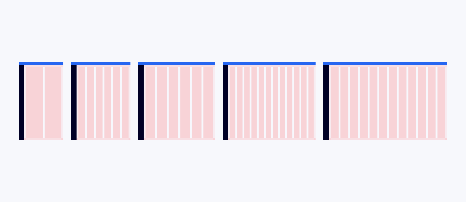
#Column size by number
#Spacing
Our spacing system uses a base unit of 1 rem (16px), ensures consistent visual separation. Prioritize using the inherent spacing of Fancy components first. For fine-tuning or custom needs, leverage our spacing tokens:
--space--x-large(24px): For generous separation between distinct blocks or sections.--space--medium(16px): Standard padding inside content areas.--space--small(12px): Default spacing between related elements.--space--x-small(8px): For tighter spacing between closely related elements.
For complete spacing system and usage guidelines, see Spacing.
#Responsive behavior and container widths
Our grid dynamically adapts to different screen sizes, ensuring an optimal user experience on any device. While the grid stretches, we use specific container widths to maintain readability and visual comfort on larger displays.
#Breakpoints
Breakpoints are thresholds where the layout adjusts for optimal user experience. Each breakpoint dictates the number of columns, margins, and gutters.
| Breakpoint | Viewport width (min-width) | Columns | Gutters | Margins | Use case |
|---|---|---|---|---|---|
--layout--small | 36rem (576px) | 2 | 24px | 24px | Mobile portrait |
--layout--medium | 48rem (768px) | 6 | 24px | 24px | Tablet portrait, Mobile landscape |
--layout--large | 62rem (992px) | 6 | 24px | 24px | Small desktops, Tablet landscape |
--layout--x-large | 75rem (1200px) | 12 | 24px | 24px | Standard desktops |
--layout--xx-large | 100rem (1600px) | 12 | 24px | 24px | Large desktops, Hi-Res displays |
#Container widths
| Container | Max Width (px) | Corresponds to viewport width | Use case |
|---|---|---|---|
Full Container | 896 - 1296px | Primarily 1200px and 1600px | Main application layouts, dashboards, complex data tables. |
Content Container | 504 - 688px | Best at 992px, 1200px, 1600px | Rendered content, documentation, forms. |
Side Panel | 600px | Applicable across 768px, 992px, 1200px, 1600px | Overlays, detail views, secondary content, modal dialogs. |
Section | 400px | Primarily 992px, 1200px, 1600px | Split views, multi-column layouts within a larger container, narrow content blocks. |
Side Navigation | 304px | Applicable across 768px, 992px, 1200px, 1600px | Primary navigation menus. |
#Layout anatomy
The layout grid primarily structures the main content area, typically below the horizontal navigation. It also accounts for interaction with other primary layout regions like Side Navigation and Side Panel.
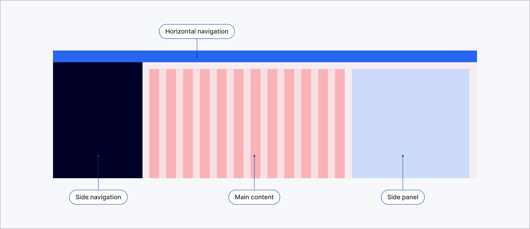
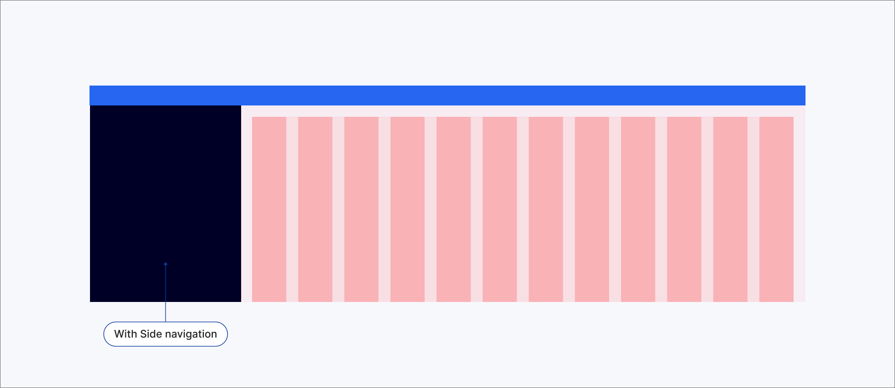
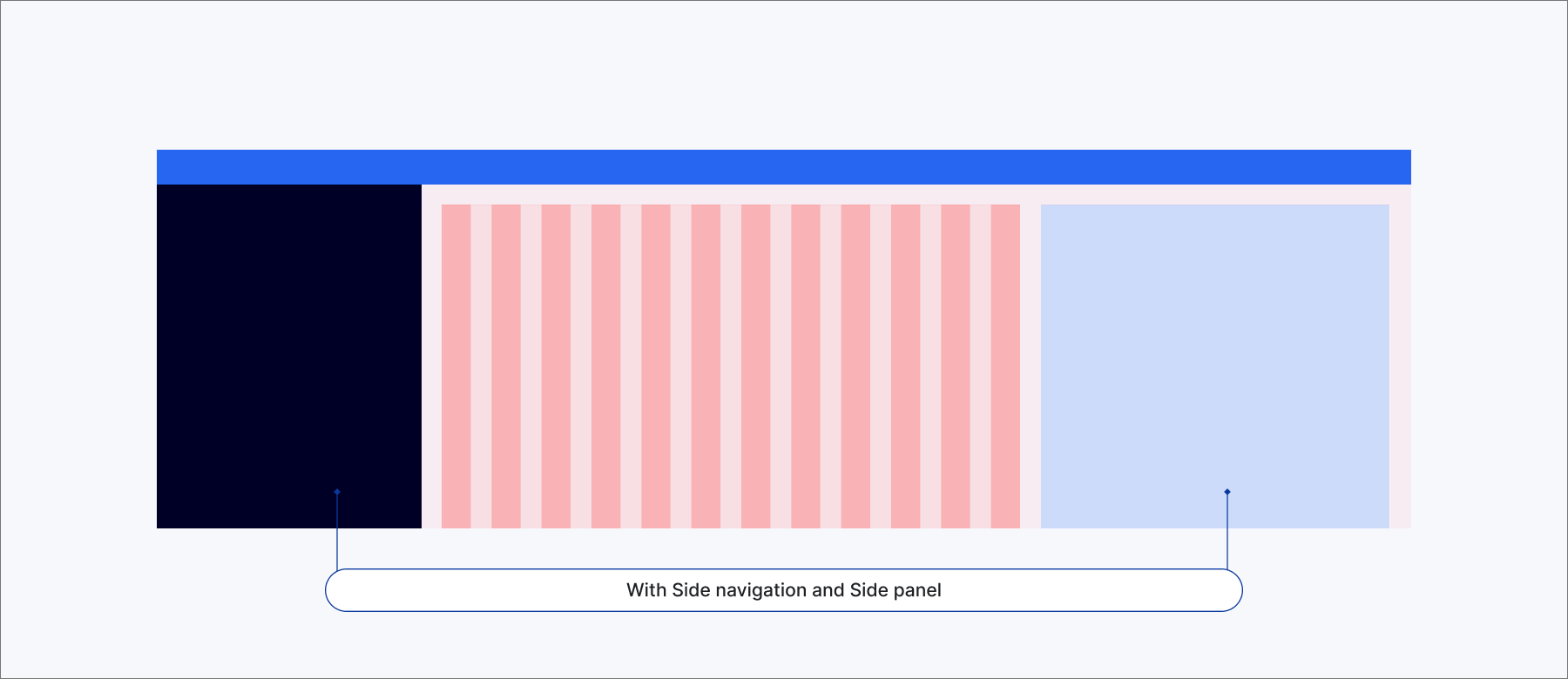
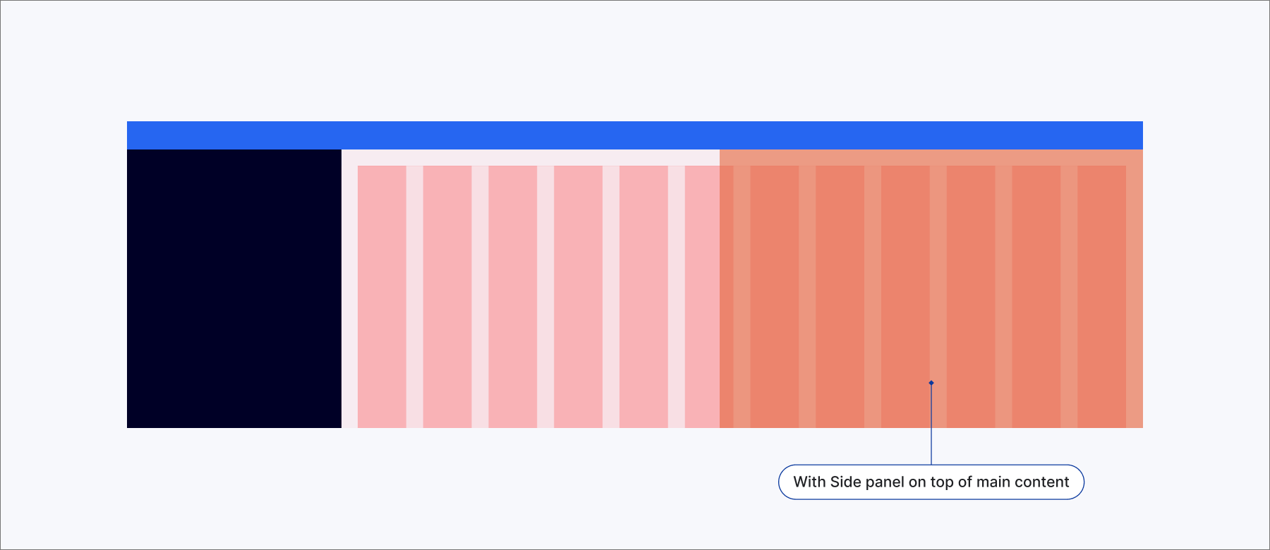
#Side navigation and Side panel
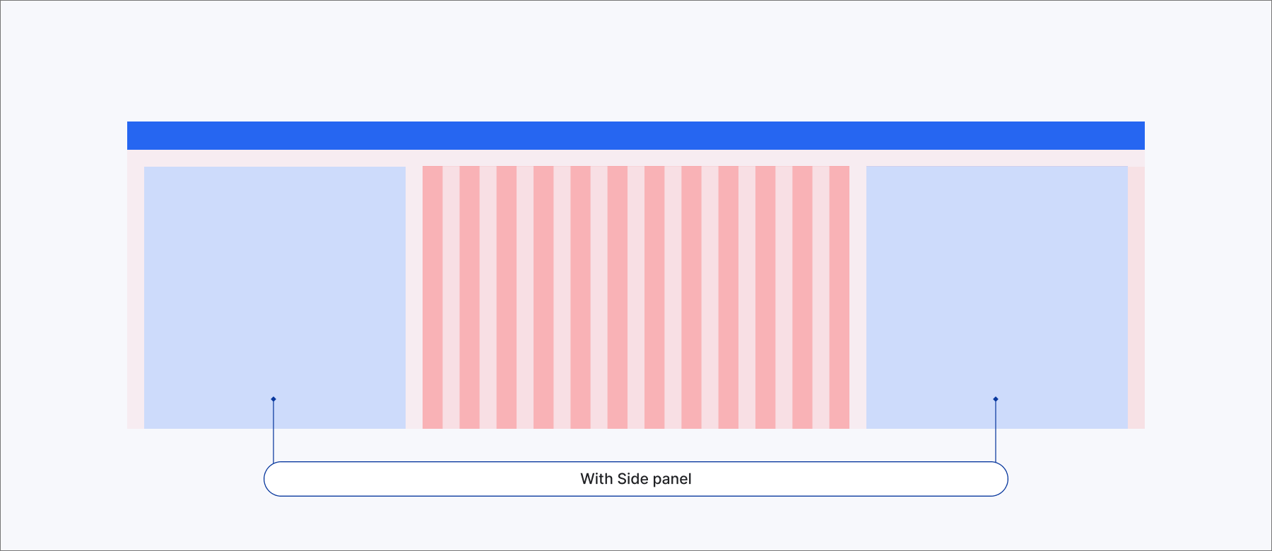
When Side Navigation or a Side Panel is present, the main layout grid dynamically resizes to fit the remaining available page area, maintaining visual harmony.
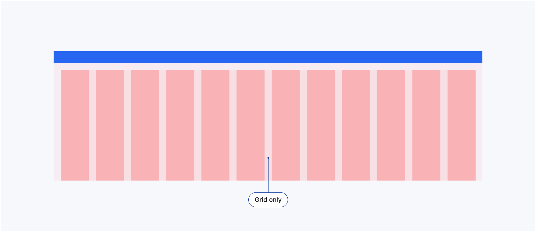
#Grid only
#Grid with Side navigation
#Grid with both Side navigation and Side panel
#Grid with Side panel on top of the main content
#Grid with both Side panel
# Side navigation
| State | Width | Suitable for viewport width |
|---|---|---|
Collapsed | 72px | 576+px |
Default | 304px | 768+px |
# Side panel
| State | Width | Suitable for viewport width | Example |
|---|---|---|---|
xxSmall | 300px | 576+px | Integration in Adobe's Universal editor |
xSmall | 370px | 576+px | Page Report |
Small | 400px | 992+px | AI sidebar |
Default | 600px | 1200+px | My policies |
Large | 800px | 1600+px | Subscription's details |
#Need more detail?
Check component documentation for specific implementation examples and responsive behavior guidelines.