Typography
Typography does more than just display text. It creates structure, guides the user's eye, and emphasizes key information. By choosing the right fonts and styles, we make our content clear, accessible, and impactful.
Product fonts
For in-product experience we use fonts from our design system typography stack to ensure optimal user experience.


IBM Plex Sans Bold: Our primary font for headings and subheadings, creating a clear hierarchy and bold visual impact.
IBM Plex Sans: Used for all body copy, ensuring maximum legibility and readability across devices.
IBM Plex Mono: Used when representing or referring to code.
Product font stacks
A font stack ensures consistent typography across devices and platforms. It's a list of fonts used in order of preference, so if the first font isn't available, the browser falls back to the next.
IBM Plex Sans Bold
font-family: 'IBM Plex Sans', -apple-system, BlinkMacSystemFont, "Segoe UI", Roboto, Oxygen-Sans, Ubuntu, Cantarell, "Helvetica Neue", sans-serif;
IBM Plex Sans
font-family: 'IBM Plex Sans', -apple-system, BlinkMacSystemFont, "Segoe UI", Roboto, Oxygen-Sans, Ubuntu, Cantarell, "Helvetica Neue", sans-serif;
IBM Plex Mono
font-family: 'IBM Plex Mono', "SFMono-Regular", Consolas, "Liberation Mono", Menlo, monospace;
Font Styles
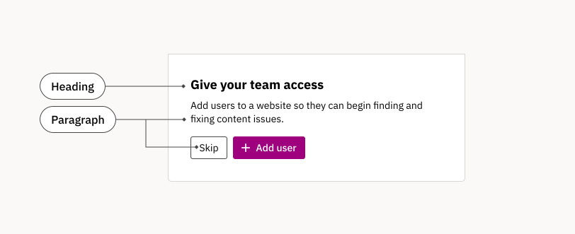
We use two primary text styles.
- Heading: These are used for headings and titles to create a clear structure and guide the user's eye.
- Paragraph: The standard style for most text in our products, designed for easy reading.
Both styles come in a range of sizes and weights for use in different contexts.
These styles are available as heading and paragraph components, making it simple for designers and developers to create a cohesive user experience.
Heading font styles
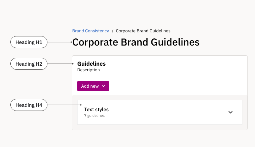
Use IBM Plex Sans Bold for headings and subheadings to create a clear visual hierarchy and guide users through your content. Headings come in a range of sizes for use in different contexts.
| Role | Tokens | Font size | Font weight | Usage examples |
|---|---|---|---|---|
H1 |
| 2rem (32px) | 500 | Use for titles of pages and page sections. |
H2 |
| 1.125rem (18px) | 700 | Component and widget headings. |
H3 |
| 1.125rem (18px) | 500 | Long-form content headings. |
H4 |
| 1rem (16px) | 500 | Long-form subsection headings. |
H5 |
| 0.875rem (14px) | 400 | Components such as badges. |
H6 |
| 0.875rem (14px) | 700 | Headings in small components where space is limited. |
Paragraph font styles
Use IBM Plex Sans for the main content of your pages and interfaces, including descriptions, messages, standalone text, and paragraphs. This font ensures optimal readability and includes spacing for easy scanning.
| Role | Tokens | Font size | Font weight | Usage examples |
|---|---|---|---|---|
Paragraph Large |
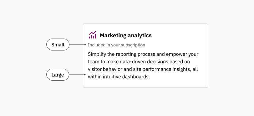
| 1rem (16px) | 400, 500, 700 | Long-form content. Use this size for a comfortable reading experience. |
Paragraph Small (default) |
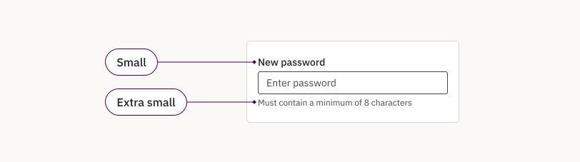
| 0.875rem (14px) | 400, 500, 700 | The default size for most UI components. |
Paragraph Extra Small |
| 0.75rem (12px) | 400, 500, 700 | Secondary-level content such as fine print or microcopy. |
Paragraph font weights
Font weight is an essential tool for creating contrast and emphasis within your text. We primarily use three font weights for paragraphs in our products, applied using our design tokens.
Regular: The standard weight for most body text, offering a comfortable reading experience and clear contrast with headings.

Medium: Aligns text with icon weights used in, e.g., buttons and labels. Also suitable for adding subtle emphasis to specific words or phrases within a paragraph.

Bold: Reserved for situations where strong emphasis is needed, but a heading style is inappropriate. Use sparingly to maintain a clean and uncluttered look.

Choose the weight that best suits the context and desired level of emphasis. For specific token names, refer to our design system documentation.
Code font style
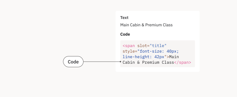
The code font (IBM Plex Mono) is reserved for when representing or referring to code.
| Role | Token | Font size | Usage example |
|---|---|---|---|
Code | | 0.875rem (14px) | When representing or referring to code. E.g., in a Page Report. |
Applying typography
Want to create more engaging and effective Siteimprove digital experiences? This typography guide offers practical tips and best practices.