Settings
This guideline offers direction for creating an organized, user-friendly structure for managing preferences and customizing the platform, emphasizing that changes should typically be applied immediately.
#Composition
The settings layout is ideal for composing the following elements:
#Essential components
- Base layout (Header): Clearly and concisely identifies the page subject, providing immediate context.
- Tabs or Accordions: Organize settings into distinct categories for clear navigation. Consider using accordions for space efficiency on smaller screens.
- Forms: The core interaction mechanism. Utilize diverse form controls with the Form element wrapper component:
- Text Fields: For open-ended input (names, emails)
- Select: For selecting from predefined options.
- Checkboxes: For toggling binary choices (on/off) or allowing users to select one or more items from a list.
- Radio Buttons: For single selections from mutually exclusive options.
#Optional components
#Layout type
Settings should be tailored to the user's needs and the platform's functionality. Choose the appropriate layout: Link to Figma Template component ↗
| When to use | Example |
|---|---|
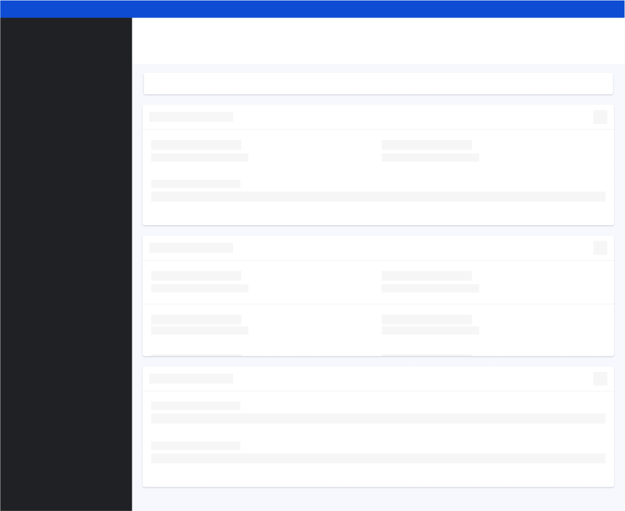
#User InputThe user input layout is ideal for gathering user input through forms for configuration and preferences. (e.g., My Profile). When designing these layouts:
|  |
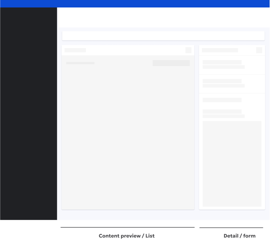
#Split viewThe split view layout is ideal for allowing users to see the real-time impact of their settings changes within a preview area. (e.g., Event tracking, Edit email template). When designing these layouts:
|  |